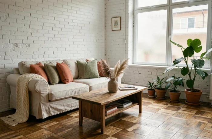
In recent years, the French home décor market has taken shape around two key trends: personalizing living spaces and growing concern about the health impact of materials. Since 2013, an indoor air emissions labeling scheme has rated construction and decorating products from A+ to C, directly influencing how people choose paint and flooring.
At the same time, Decree No. 2024-134 of February 21, 2024, is steering public procurement toward furniture reuse—a policy signal that is gradually shaping the range of products available to consumers. This context is changing how we think about our interiors.
Indoor air emissions labels: an often-overlooked décor factor
Choosing a paint color or laminate flooring is as much a health decision as an aesthetic one. Adhesives, varnishes, paints and wall coverings sold in France carry an indoor air emissions label, rated from A+ (very low emissions) to C (high emissions). In effect since 2013, according to the Ministry for the Ecological Transition, this rating measures the volatile organic compounds released into a room after installation.
In practice, two products in the same color can have different ratings. A wall coating rated C in a 20-square-meter living room will not produce the same indoor air quality as one rated A+. Get into the habit of checking the label on the tin or consulting the technical data sheet before settling on a shade.
This factor also influences the choice of raw materials. Untreated solid wood generally emits fewer pollutants than particleboard. For anyone looking for home décor inspiration from Maisons et Conseils, it’s worth considering finishes and their impact on air quality from the design stage—not after the purchase.
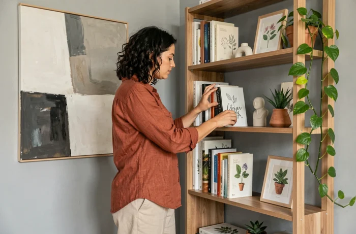
Colors and natural light: choose a palette to suit the room
Décor guides offer plenty of on-trend palettes but don’t always mention a physical constraint: natural light can dramatically change how a color looks. A sage green that looks appealing on a phone screen can turn into a dull khaki in a north-facing room with just one narrow window.
A practical tip is to test a paint sample directly on the wall, then look at it at three different times of day (morning, noon and late afternoon). The difference between east- and west-facing rooms is often surprising.
Dark colors in small spaces: not a hard-and-fast no
A common belief is that dark colors make a room look smaller. The reality is more nuanced. Midnight blue on a single wall in a well-lit entryway, with warm light from a ceiling fixture, can create a sense of depth that white cannot. It all depends on the painted area, the type of lighting and the ceiling height.
The common mistake isn’t choosing a dark shade; it’s painting all four walls without adding another light source. A dark accent wall works when balanced with targeted lighting.
Secondhand furniture: an aesthetic choice, not just a budget-friendly one
Furniture reuse is gaining visibility. Decree No. 2024-134 of February 21, 2024, sets progressive targets for public procurement of reused goods, including in the “furniture and interior design” category. This requirement does not apply to individuals, but it is helping build a market for refurbished furniture on a scale that did not exist five years ago.
When decorating a home, secondhand furniture offers a quality that standardized new pieces often lack: the distinctive character of patinas, wood species and period proportions. A solid teak dresser from the 1960s is unlike any other. It makes a statement in a contemporary living room without needing to be styled.
What to check before buying an antique piece of furniture
A salvaged piece of furniture may need more preparation than a new one. Here are a few things to check:
- Structural condition: check the joints (mortise-and-tenon joints, mortises and dowels) before focusing on appearance. A sticking drawer often points to a warped frame, not just a lack of wax.
- Existing finishes: old varnish may contain substances that are now regulated. Stripping it and applying a finish rated A+ for emissions lets you combine vintage character with good air quality.
- Size and fit: furniture made before the 1980s rarely follows today’s standards. Measure the available space down to the centimeter to avoid unpleasant surprises on delivery.
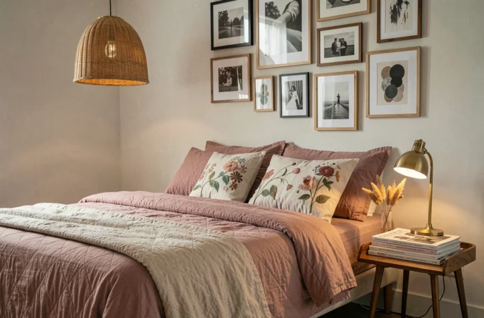
Materials and textures: create a tactile balance in every room
Interior design is about more than choosing colors. The tactile quality of a space directly affects how comfortable it feels. A living room furnished entirely with smooth surfaces (glass, brushed metal, lacquer) can feel cold, even when the colors are warm.
Combining at least three different textures in one room creates a sensory balance: a bouclé sofa, a raw wood coffee table and a thick wool rug are enough to give a living room structure without piling on decorative objects.
The “match everything” trap
Coordinating every element in a room (cushions, curtains, rugs and lampshades) within the same color palette is a habit encouraged by big-box store catalogs. The result often feels staged, like a showroom photo. Interiors with real personality mix materials from different sources: crumpled linen beside worn leather, or handmade ceramics on a steel shelf.
This contrast between smooth and textured materials works because it reflects the variety we encounter naturally. An overly uniform interior tires the eye; one that is too eclectic overwhelms it. The sweet spot is three to five dominant materials per room.
Creating an interior that feels like you isn’t about following a predefined style. It comes down to practical decisions: the emissions rating of a wall coating, how light falls on a painted wall, where a piece of furniture comes from, and how textures work together in a given space. These technical choices, made one at a time, are what ultimately make a home distinctive.